Mobile layout
The mobile app runs on phones, foldables, tablets and resizable iPad windows. One rule keeps that manageable: each layer below makes one decision, and no layer makes another's. A feature screen never asks which platform or window width it is on.
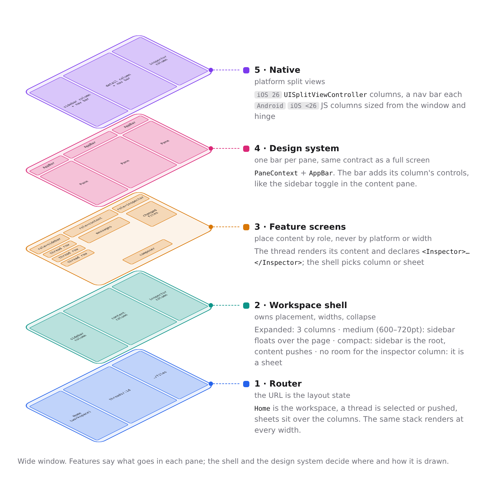
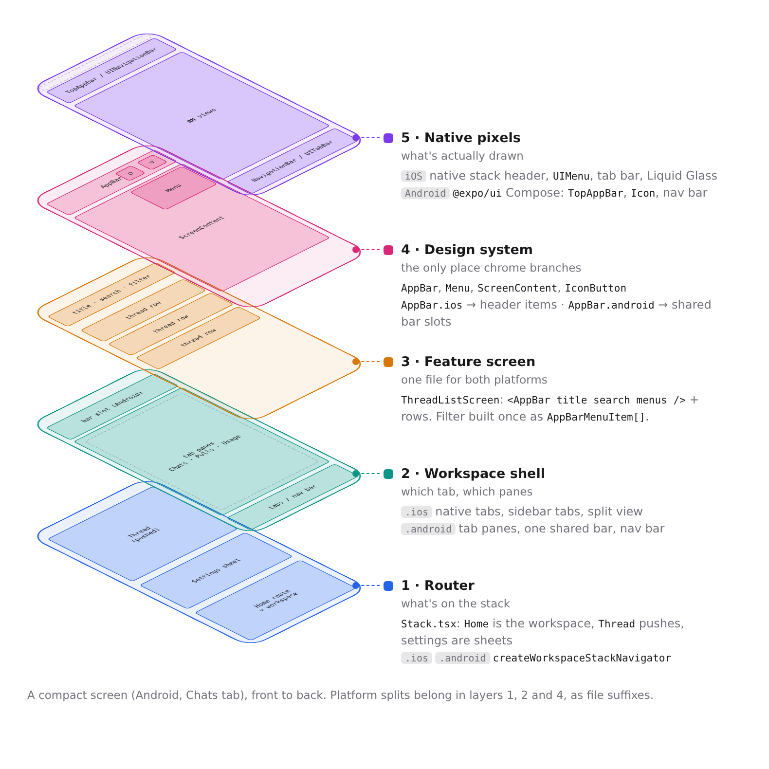
The layers
Router. The root stack is the layout state: what is selected, what is pushed, which sheet is open. Rotating, folding or resizing renders the same stack differently. Nothing remembers which column a page was in. Each route declares what it is with a preset (
pageRoute,sheetRoute,modalRoute,immersiveRoute); the preset owns detents, corner radius, header appearance and the Android fallback. See Mobile navigation.Workspace shell.
features/layoutowns placement and widths, from the width class inlayout.ts:- Expanded: sidebar, content and inspector columns.
- Medium (600–720pt wide): the sidebar sits beside a list and floats over a page.
- Compact (under 600pt either way): the sidebar is the root, and pages push.
- Where the inspector column does not fit, the inspector is a sheet.
The workspace tabs, dock and toolbars live in
features/layout/workspace. Stacks nested in a sheet or popover, and screens rendered under a route of their own, also come from here.Feature screens. A screen places content by role. It draws one
AppBar(orSheetHeaderfor a form sheet), renders its page, declares its inspector panes with<Inspector>, and asks for them withshowInspector(). The shell decides between column and sheet. Choosing a route, a component, header options or an inset by width or platform here is the bug this structure exists to prevent.Design system. Every pane, page, sheet and modal has an
AppBarwith the same contract on both platforms; a sheet or modal passesonClose.PaneContexttells the bar which column it is in, so it adds that column's controls, such as the sidebar toggle. Where content meets the bar comes fromuseBarInset. Chrome branches by platform only here.Native. On iOS 26, the columns are
UISplitViewControllercolumns with a navigation bar each. On Android and on iPadOS 18–25, the shell draws the same columns in JS from the window and hinge metrics. Android never shows the native stack header; every bar is drawn in-tree.
Platform splits live in layers 1, 2 and 4, as .ios and .android files.
Traps
- iPadOS 18–25 runs the JS columns, and the iOS deployment target is 18. Code that looks Android-only in the JS column path is still live on those iPads.
- Android renders
Hometwice: in the sidebar column and as the root of the content stack. The sidebar copy is never the focused route, so hooks that gate on focus (such as Back handling) must also acceptusePaneRole() === "sidebar". - Modals and full-screen pages are presented over the columns and render with no pane role, so they get no column chrome.
- On iOS each inspector pane is a native screen of its own, and only the active one is attached. A pane hidden with opacity still has its native bar, toolbar and scroll view in the window, and UIKit shows them over the visible pane.
- A route opened from the inspector sheet must wait for the sheet to close, through
InspectorSheetContext. Presenting over a closing sheet races its dismissal on iOS.